Keethings Digital Workspace
Keethings assists enterprises in advanced sectors like Industry 4.0 to digitize processes, empower their workforce, and enhance the user experience in manufacturing operations.
Role
Product Designer
(Solo)
Duration
6 months
Client
Keethings
Type
Startup
Business model
B2B
Sector
Tech - AI
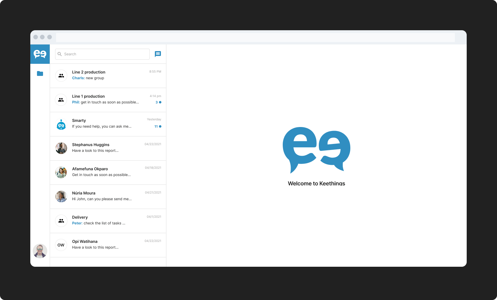
What is Keethings Digital Workspace?
Keethings Digital Workspace is a modular platform designed to digitize operational processes and enhance workforce efficiency.
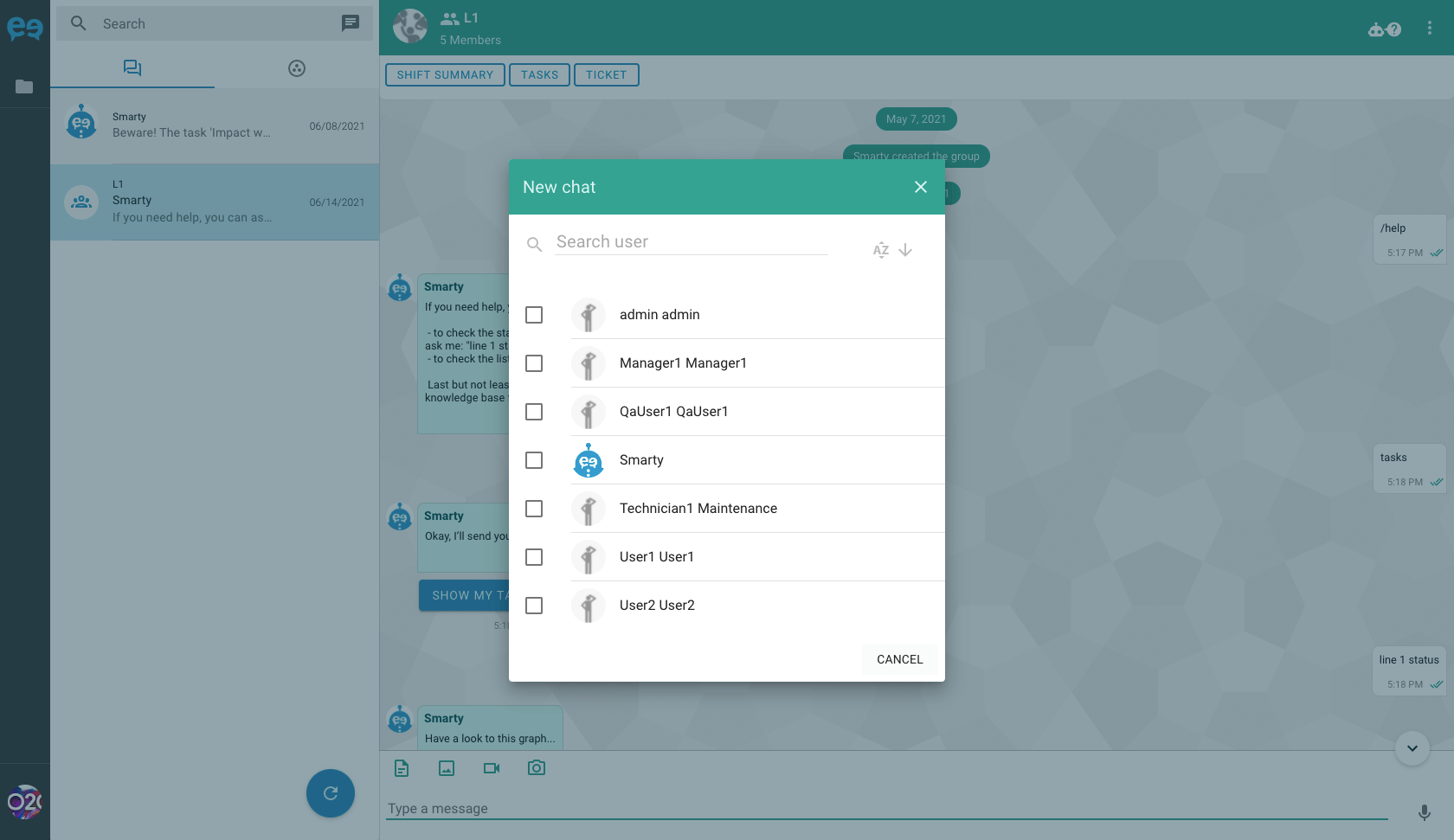
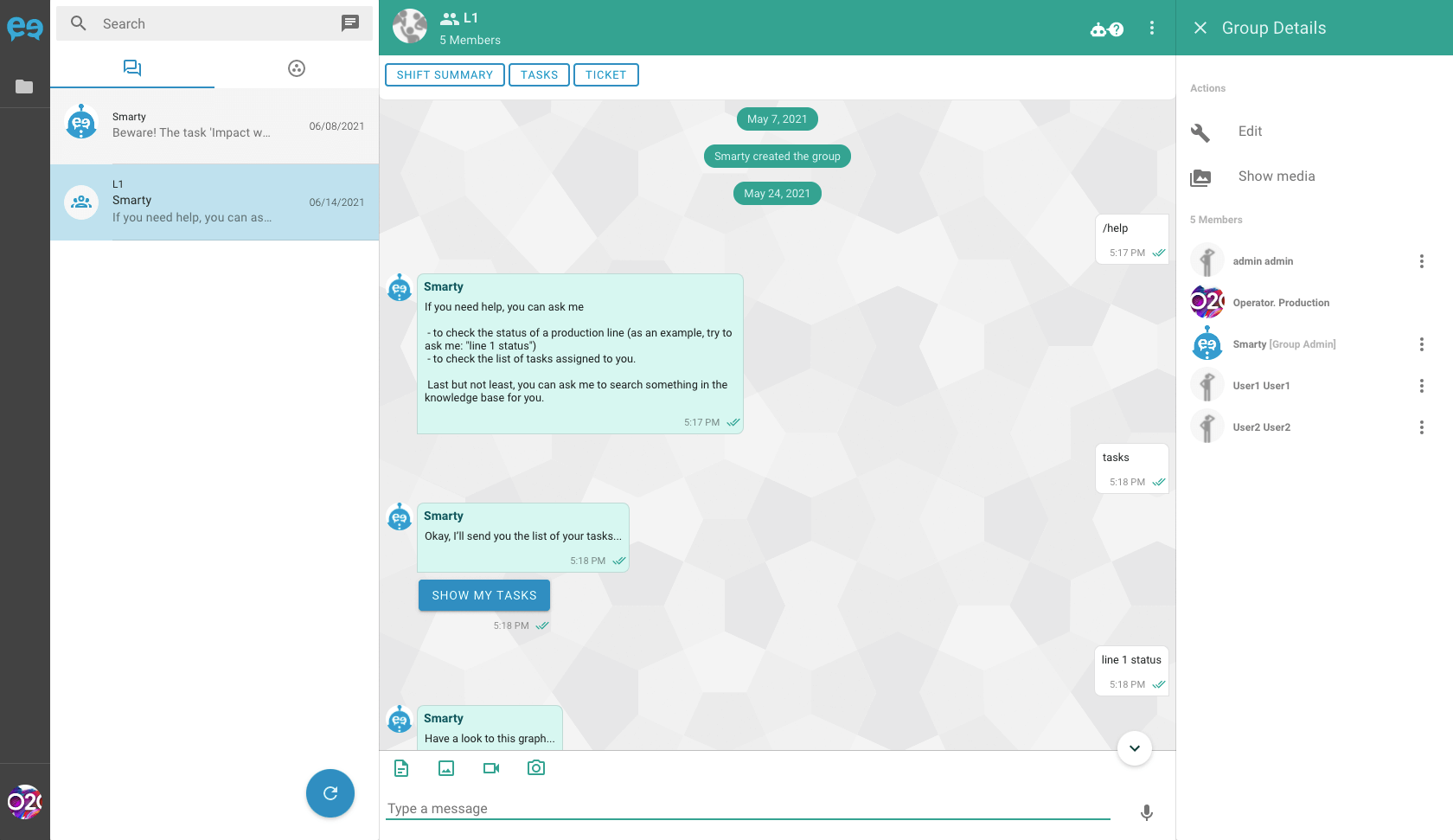
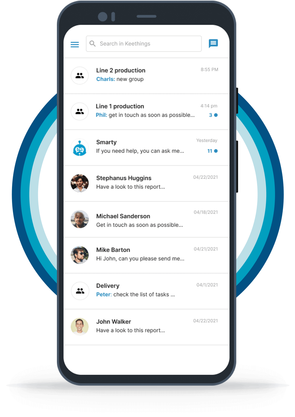
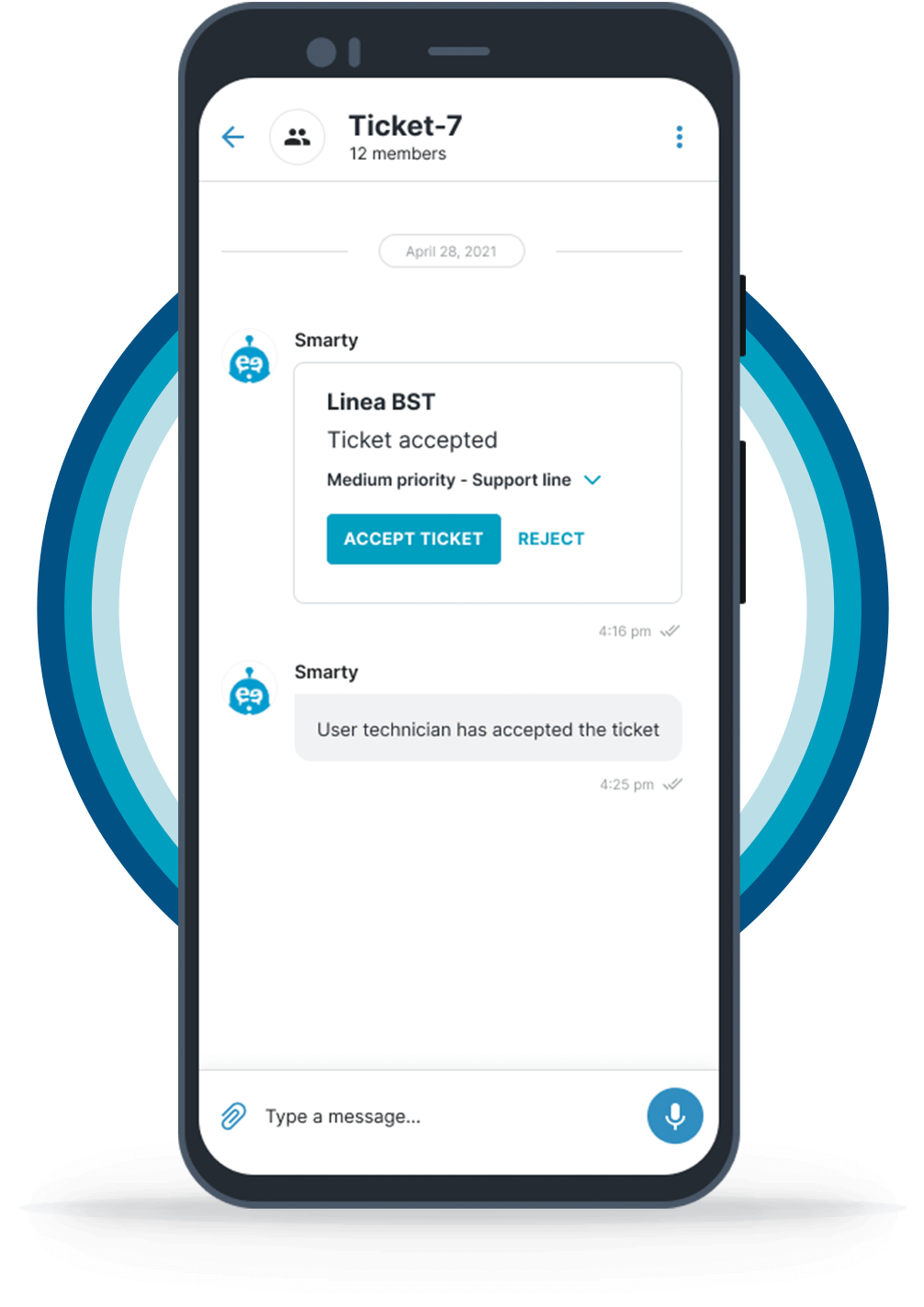
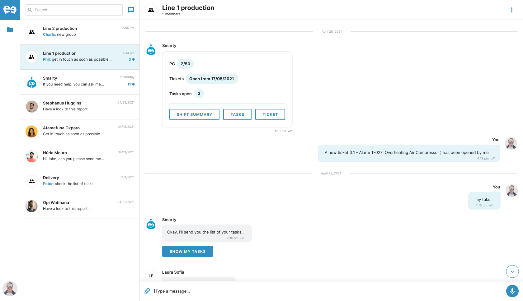
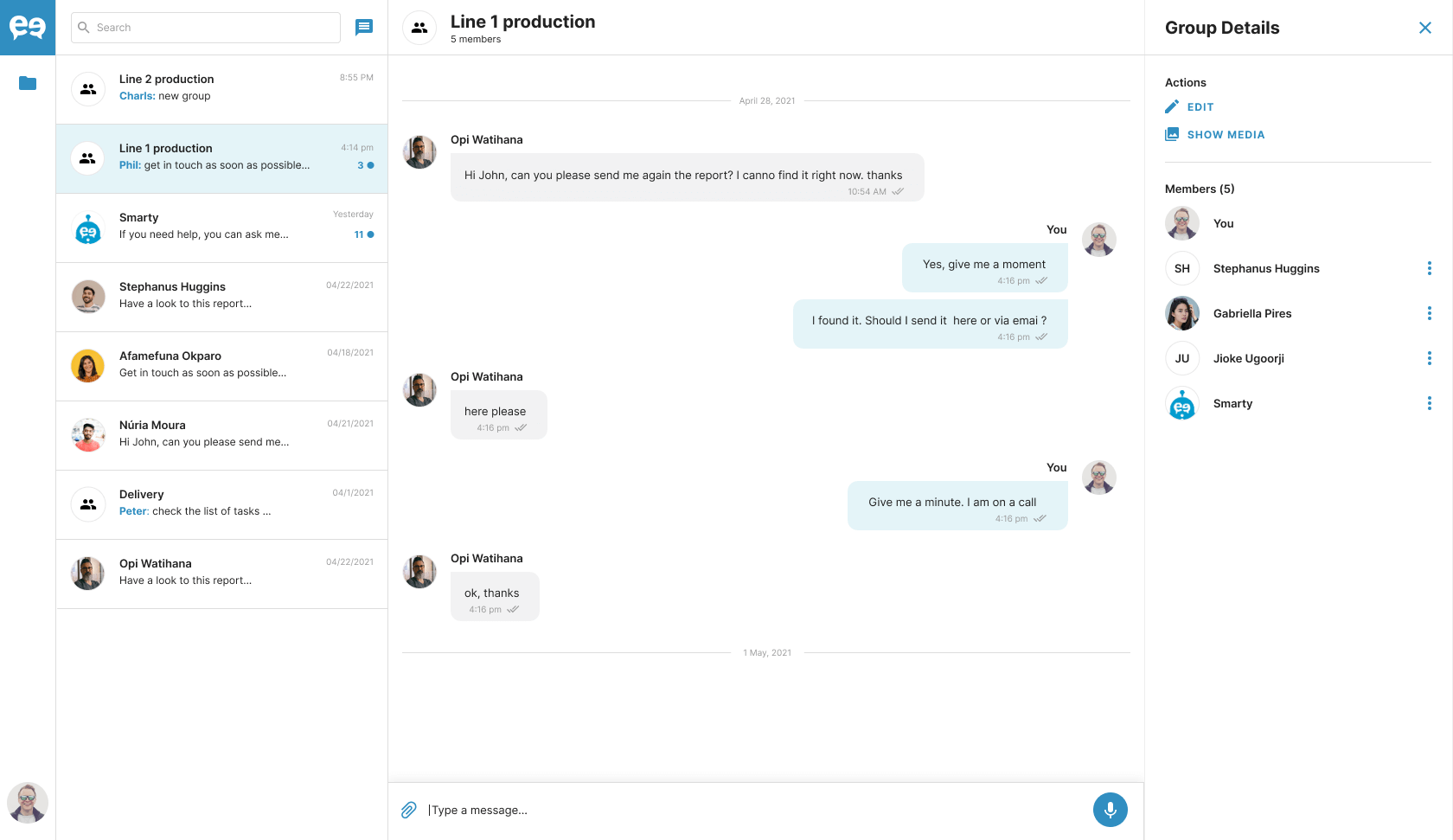
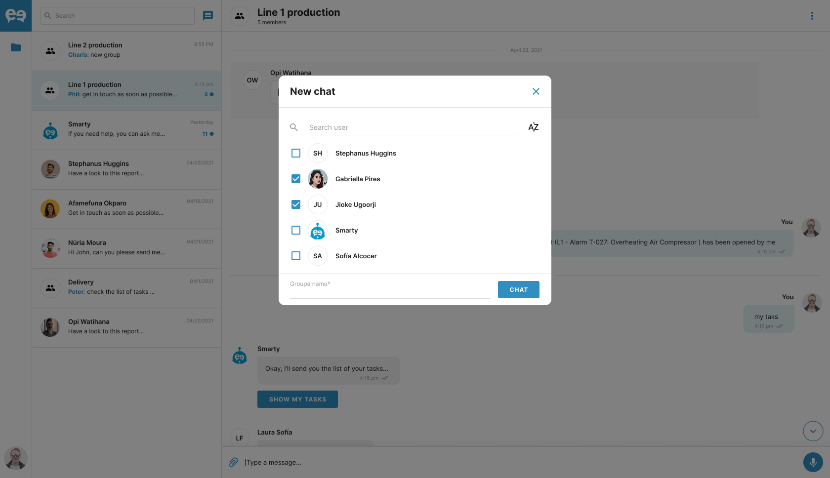
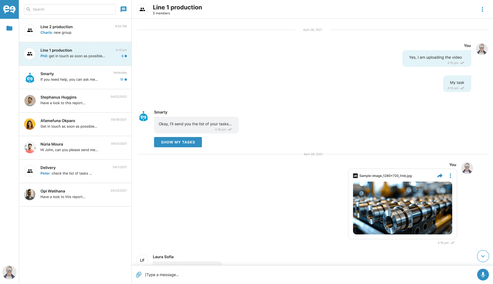
With Keethings, every worker can enhance their performance by gaining instant access to key functions and elevating collaboration with colleagues, technicians, and supervisors through the app’s core feature: an integrated chat system.
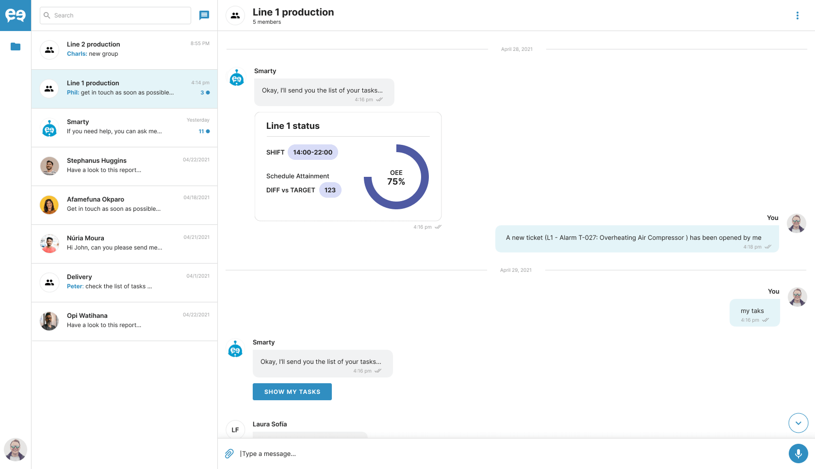
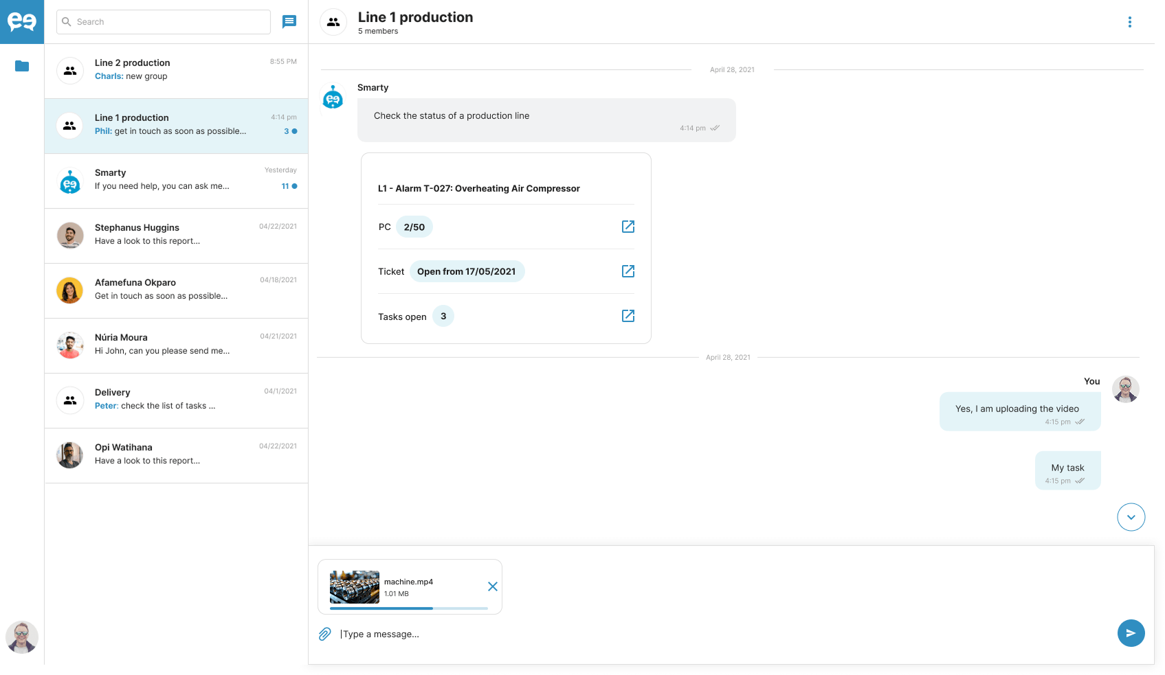
The platform integrates seamlessly with enterprise software and includes an AI-powered Digital Coworker, Smarty.
Key features:
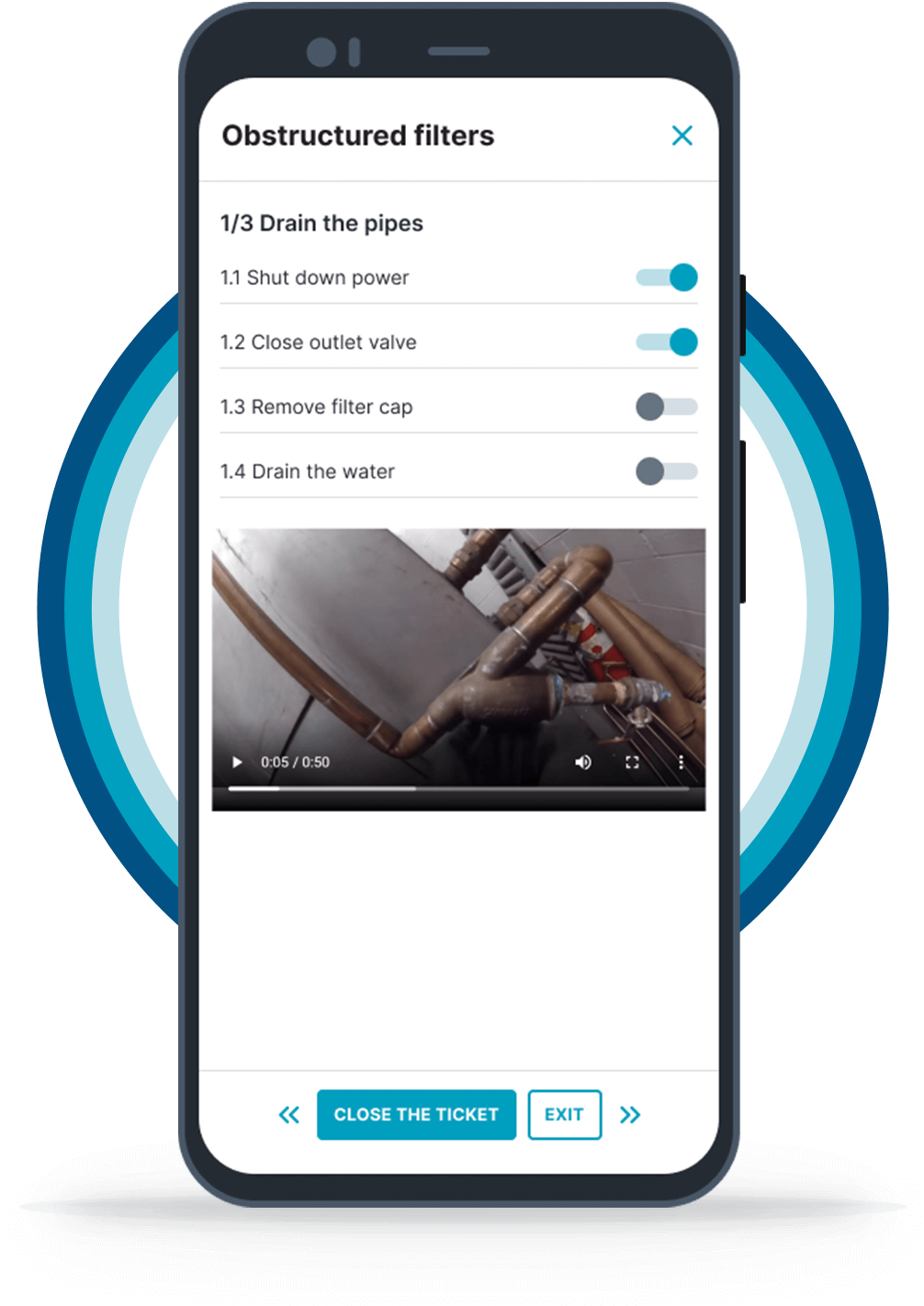
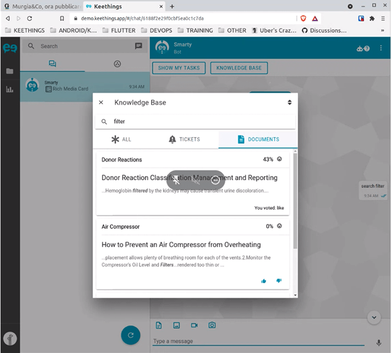
- Knowledge Base: to improve problem solving capability
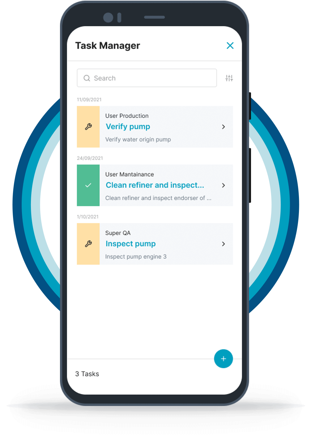
- Task Manager: to organize operational tasks
- Checklist: to guide users through their activities
- Notifications & Alerts: to improve workforce responsiveness
- Analytics: to keep track of performance
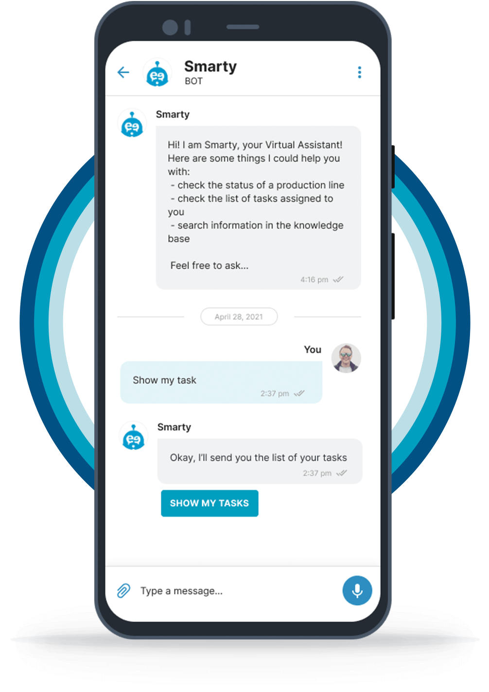
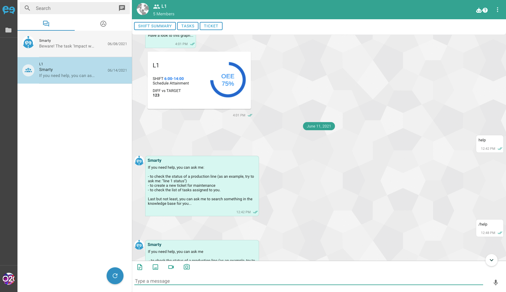
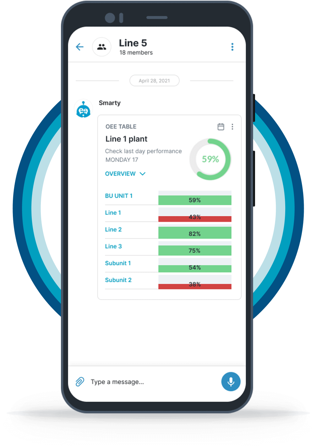
Hi, I am Smarty !
AI virtual assistant that supports users in their daily activities by providing easy access to every function of the Keethings app through inquiries via chat messages or voice instructions.
The case study focuses on the strategic redesign of:
💬 Keethings App
Improving usability through more efficient user interactions while establishing UX patterns and a cohesive UI direction.
📒 Knowledge Base Module
Overcoming search limitations and improving document retrieval to support industrial workflows during emergency situations.
💬 Keethings App
Problem
The MVP app was developed with a technology-driven method, lacking a clear ux strategy and user-centered focus approach.
As the client grew and its customer base expanded, it became evident that to stay competitive with competitors, a UX/UI overhaul was essential. Improving usability, ensuring visual consistency, and delivering a seamless cross-device experience were key business goals for the client to attract new customers and retain existing ones accelerating theri productivity while reducing risks.
Problem
⛔️ Poor mobile & tablet experience
Industrial workers relied heavily on mobile and tablet devices, but the interface was not optimized for smalle devices
⛔️ Cumbersome user flows
The steps the users must follow to complete a task were complex and unintuitive reducing users productivity
⛔️ Absense of feedback in response to the user’s actions
The lack of feedback makes the app feel unresponsive and unreliable, diminishing user confidence and creating uncertainty, ultimately reducing trust in the system
⛔️ Lack of visual consistency
The UI didn’t align with the overall Keethings brand
Solution
I adopted a mobile-first and tablet-first approach since the app is mainly used on small devices in work environments where users are constantly on the move.
The visual language has been refined for a cleaner, more accessible interface. A new color palette with optimized contrast ensures both brand alignment and accessibility.
By adopting the 8px grid system and introducing a consistent Card UI element, the interface is now structured in a more organized and consistent manner. The choice of a new font with varying weights improves readability, accessibility, and content hierarchy.
Impact
➡️ Faster adoption among industrial teams due to improved usability
➡️ Higher engagement, driven by a more intuitive chat workflow
➡️ Seamless integration with other Keethings modules
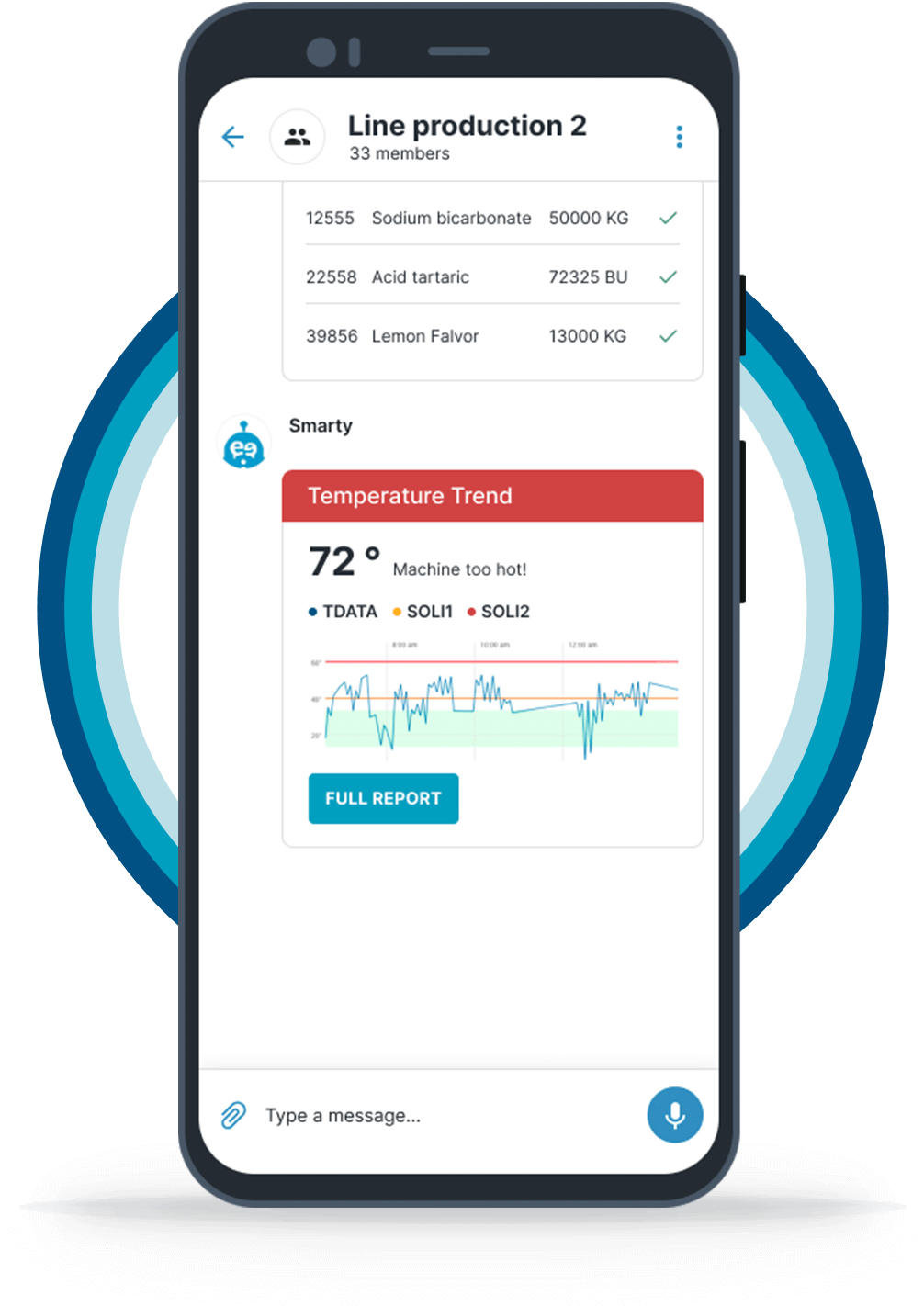
Micro-interactions have been implemented, providing immediate and intuitive feedback to the users to enhance user engagement and improve usability.
✅ Toast messages for actions like file sharing or group creation
✅ Progress bars for media uploads/downloads
✅ Notifications for incoming messages, media files, or group invitations
✅ Smooth animations and transitions for a fluid experience
UX/UI Enhancements
✅ Refined Mobile-First UI
Focused on ergonomic interactions, ideal for users in fast-paced industrial setting
✅ Prompt feedback system
To enhance user engagement and retention
✅ Improved color & typography contrast
Improved readability and accessibility
✅ Enhanced iconography
Simplified action triggers to reduce cognitive load
✅ Card-based design elements
Created a modular, scalable UI approach with contextual CTA
✅ Adoption of Ionic Toolkit for a seamless transition from Material
Ensured a cross-platform experience that worked seamlessly across iOS and Android keeping Angular as base framework
Impact
➡️ Faster adoption among industrial teams due to improved usability
➡️ Higher engagement, driven by a more intuitive chat workflow
➡️ Seamless integration with other Keethings modules
📒 Knowledge Base
Problem
The Knowledge Base Module is an essential tool within Keethings Digital Workspace, enabling workers to search and retrieve critical documents in real-time.
Industrial teams often rely on this module to troubleshoot machinery issues, access safety procedures, or find technical manuals — often in high-pressure situations.
However, the existing Knowledge Base search was inefficient, inaccurate, and disruptive. The Knowledge Base module has limited functionality and presents several limitations.
Search experience issues:
⛔️ Inefficient
Finding the right document was time-consuming
⛔️ Disruptive
Users had to exit the app to download and view documents
⛔️ Unstructured
It was impossible to group, save, or rate documents.
⛔️ Inaccurate
The algorithm was overly rigid, ignoring user judgment.
⛔️ Unreadable
Documents were not displayed in an easy-to-read format.
How might we
➡️ How might we reduce the time needed to search for documents and enable quick access in emergency situations?
➡️ How might we enhance team collaboration and knowledge sharing in a more effective way?
➡️ How might we improve the accuracy of search results over time?

Solution
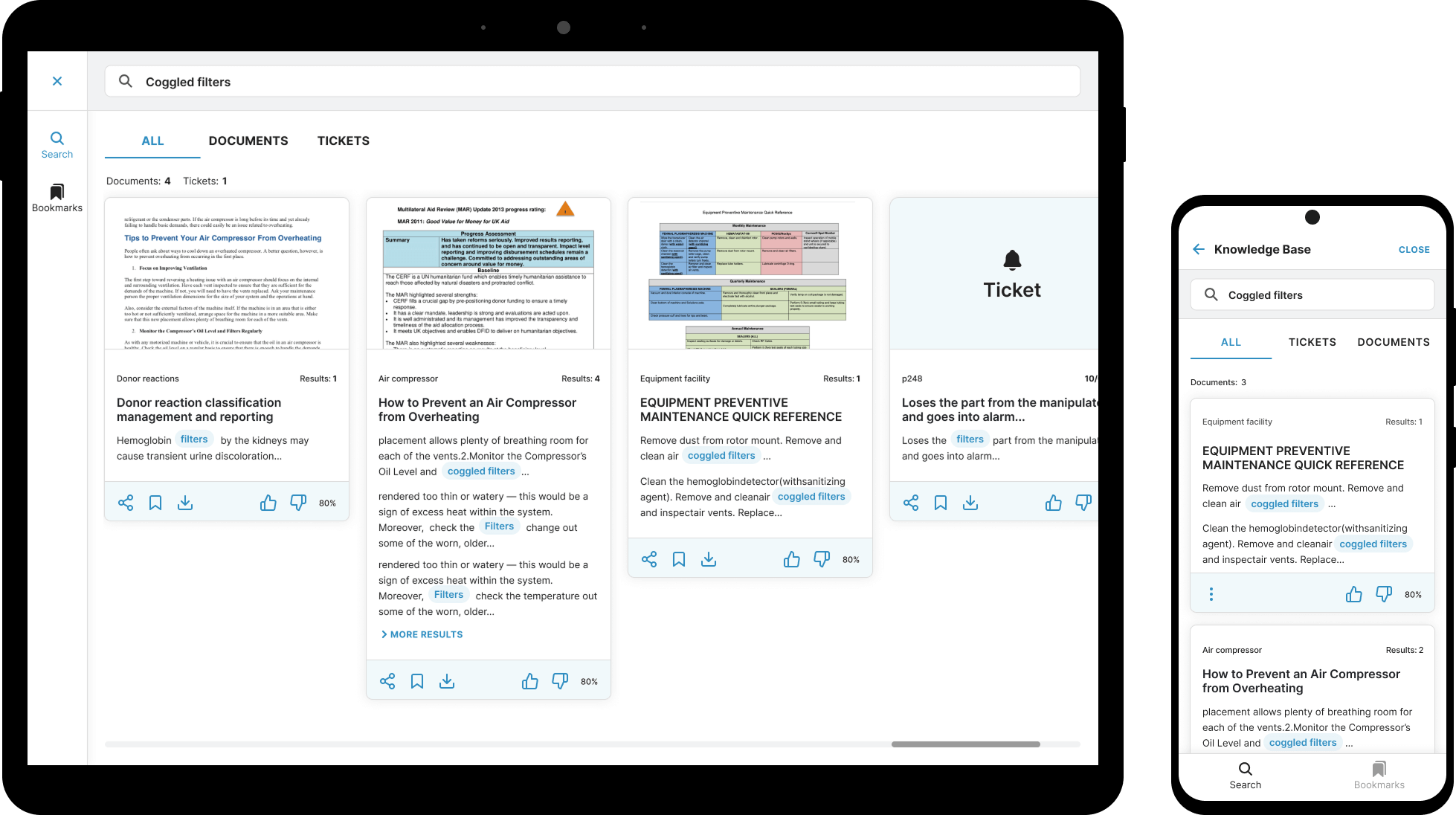
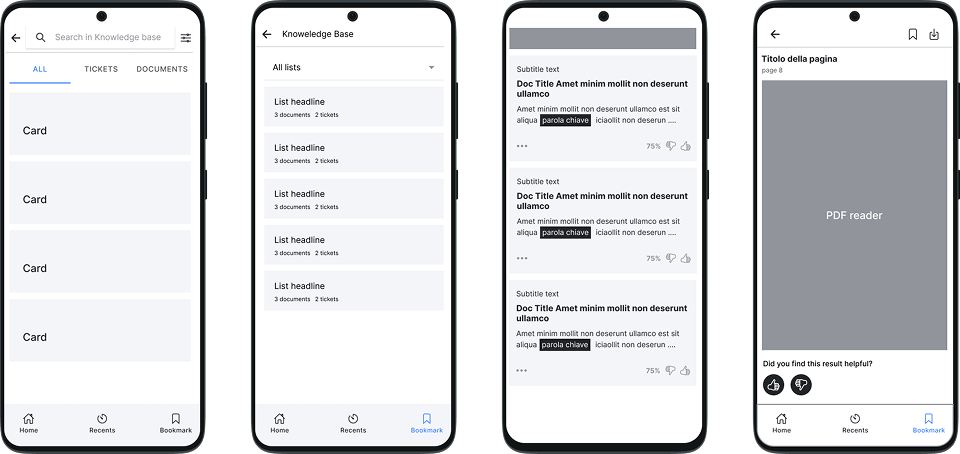
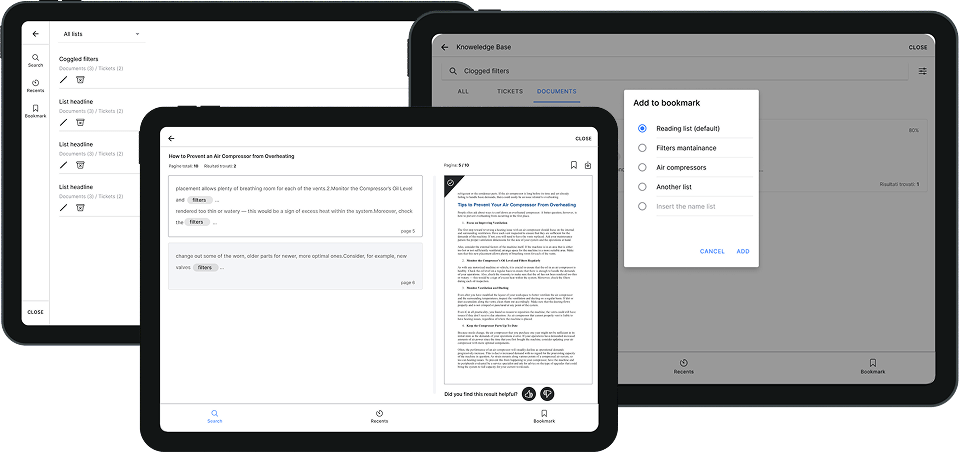
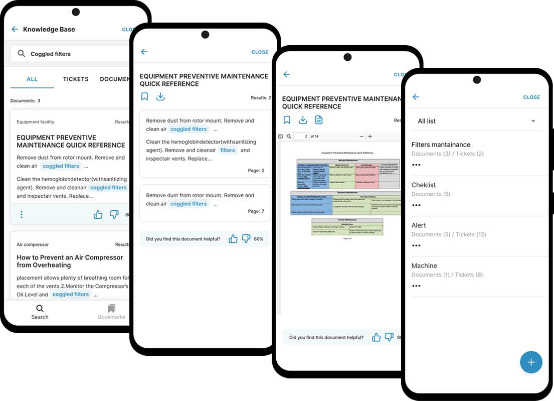
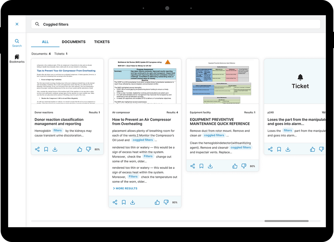
To enrich the information provided in suggested results and help users make informed choices among multiple options, the algorithm now extracts additional details, including tags, document covers, the number of pages, specific document pages, and percentage ratings.
To further improve the accuracy and relevance of suggested results, users can now rate documents . This allows them to influence the algorithm with their critical evaluation, helping refine the accuracy of future suggestions over time.
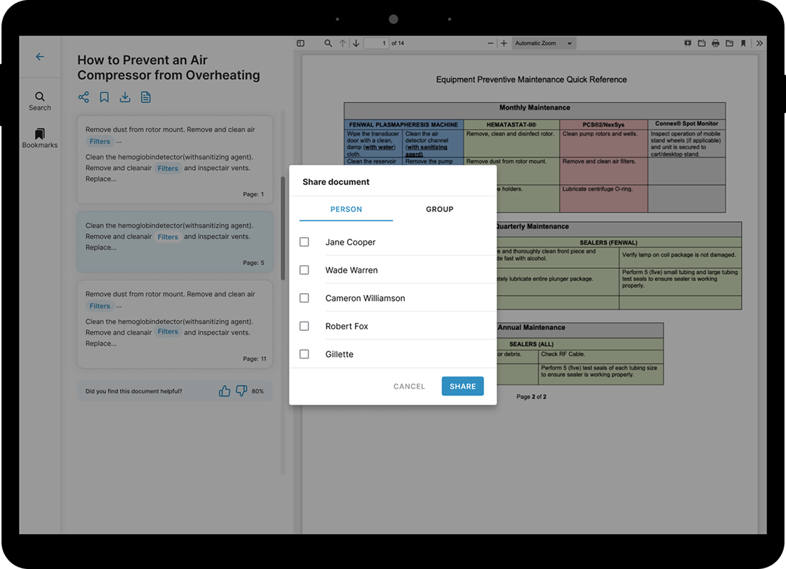
To streamline workflows and reduce task completion time across various industry departments, two new features have been introduced: bookmarks and document sharing. These ensure documents remain easily retrievable, particularly in similar emergency situations.
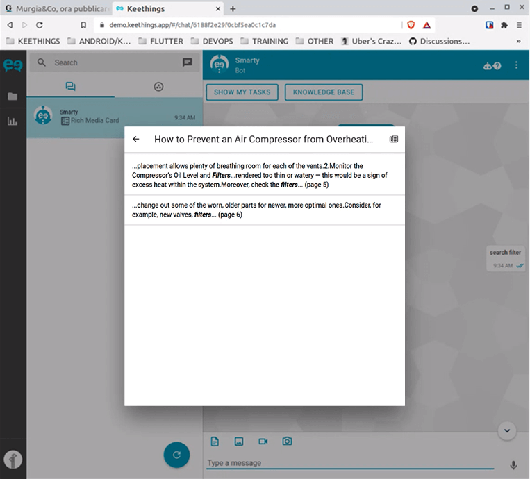
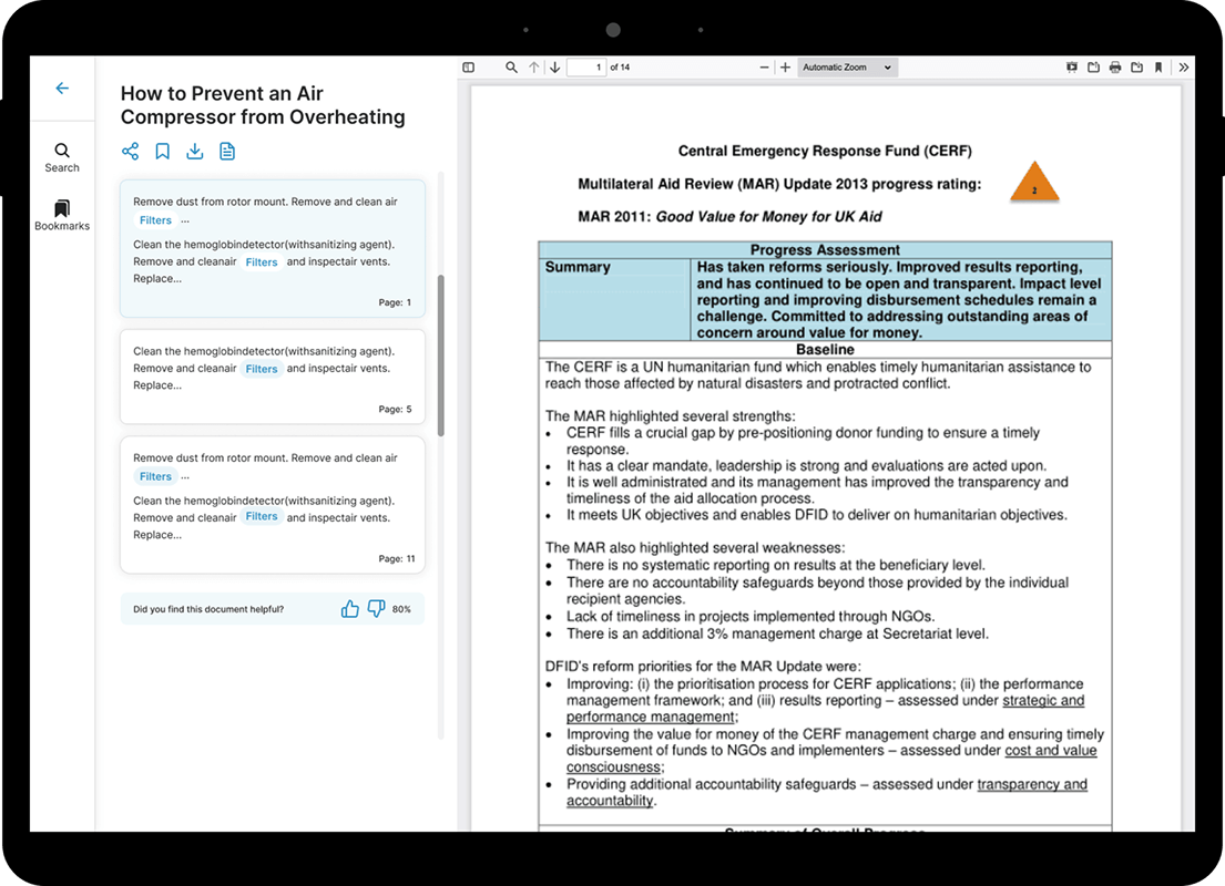
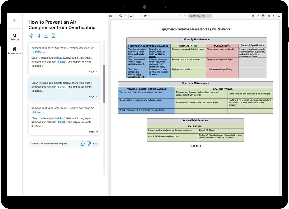
The most impactful enhancement is the ability to view documents directly within the Knowledge Base — without leaving the app or downloading them.
Impact
➡️ The Knowledge Base overhaul reduced document search time by 30%, allowing workers to solve problems faster
➡️ The in-app document preview eliminated unnecessary downloads, creating a seamless user experience
➡️ Increased collaboration with document sharing & bookmarking features
➡️ NPS score increased from 20% to 55% after 6 months
Process
I approached the project using the Design Thinking methodology.
I collaborated with the client to gain a deep understanding of their business objectives and customers (with CEO and PM). I also worked closely with the Product Owner (PO) to determine the priority of features to be released and with the Technical Team to identify any technological limitations of the algorithm and potential improvements.
⬇︎
UX Research
I gathered user feedback through interviews to better understand their needs and pain points. I analyzed quantitative data collected by the client over time, including device usage percentages in work environments and the most commonly used viewports, to gain insights into user behavior and preferences.
Additionally, I conducted an app benchmark to explore features related to bookmarking and file sharing.
From this research, I identified the essential needs that guided the subsequent design activities.
What users expect:
➡️ More precise search results based on keywords
➡️ A clear and organised overview of suggested results / documents
➡️ The ability to quickly access and read documents within the app, share them with colleagues, and easily retrieve them for future reference
Ideate solutions
Following the discovery phase, an ideation phase was conducted to explore and validate potential solutions. This process began with the creation of user flows and low-fidelity prototypes to test and refine the new approach.
Seamless document discovery experience
✅ Card-Based search results
Each document is now presented in modular cards with tags, previews, and ratings, making it easier to scan and evaluate. Keyword highlighting enhances readability, allowing users to find relevant content more efficiently
✅ In-App document preview
Eliminates the need for downloads, enabling users to view files instantly within the app
✅ AI-Powered relevance scoring
Users can rate documents to improve search accuracy over time, ensuring the most relevant results appear first
✅ Optimized mobile & tablet experience
• Swipe gestures for effortless navigation.
• Custom layouts tailored for mobile (portrait view) and tablet (landscape view) to maximize available screen space while maintaining consistent UX patterns and interactions
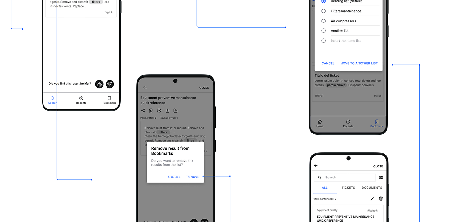
✅ Bookmark & share features
Users can save frequently used documents and research queries and easily share them with colleagues via chat for better collaboration
Testing and final UI design
✅ Conducted user testing sessions for validation.
✅ Delivered Figma prototypes, UI screens, and documentation for seamless developer handoff.
Impact
➡️ The Knowledge Base overhaul reduced document search time by 30%, allowing workers to solve problems faster
➡️ The in-app document preview eliminated unnecessary downloads, creating a seamless user experience
➡️ Increased collaboration with document sharing & bookmarking features
➡️ NPS score increased from 20% to 55% after 6 months
“The new Knowledge Base is a game-changer! No more switching between apps—we can find what we need instantly.”
Lessons learned
➡️ Considering algorithm limitations from the start helped shape design decisions effectively
➡️ Stakeholder collaboration were crucial in making critical decisions
➡️ Qualitative research and quantitative data played a key role in making UX decisions
➡️ Prioritizing a mobile-first and tablet-first approach led to more effective UX outcomes
➡️ AI-powered search significantly enhanced result accuracy
Client testimonial
" We just completed a total re-design of a business chat app for 4.0 industry and Roberto made I great job. Working on refreshing an existing app might be much more difficult than starting from scratch, due to tech/UX constrains and so on... Roberto showed on this very uncommon skills and strong practical approach. "
Fabio Beoni
Developer - Mobile / Web / Firebase / Google Cloud at Keethigns
Let's design together ✨
Feel free to reach out to talk about a project.
Hey there, this i