DocFly
DocFly - Digital Preservation is is the most reliable solution, providing legal and evidentiary value for storing, organizing, and protecting digital documents. The ideal solution for the dematerialization of physical archives.
Role
Product Designer
Solo
Duration
12 months
Client
Aruba SPA
Type
Large organisation
Business model
B2B & B2C
Sector
Tech
DocFly needed to evolve
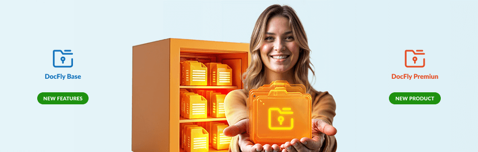
DocFly had the potential to become a leading solution in the digital preservation landscape. The Base version required an evolution to better meet real user needs and offer a more complete and competitive product compared to alternatives on the market.
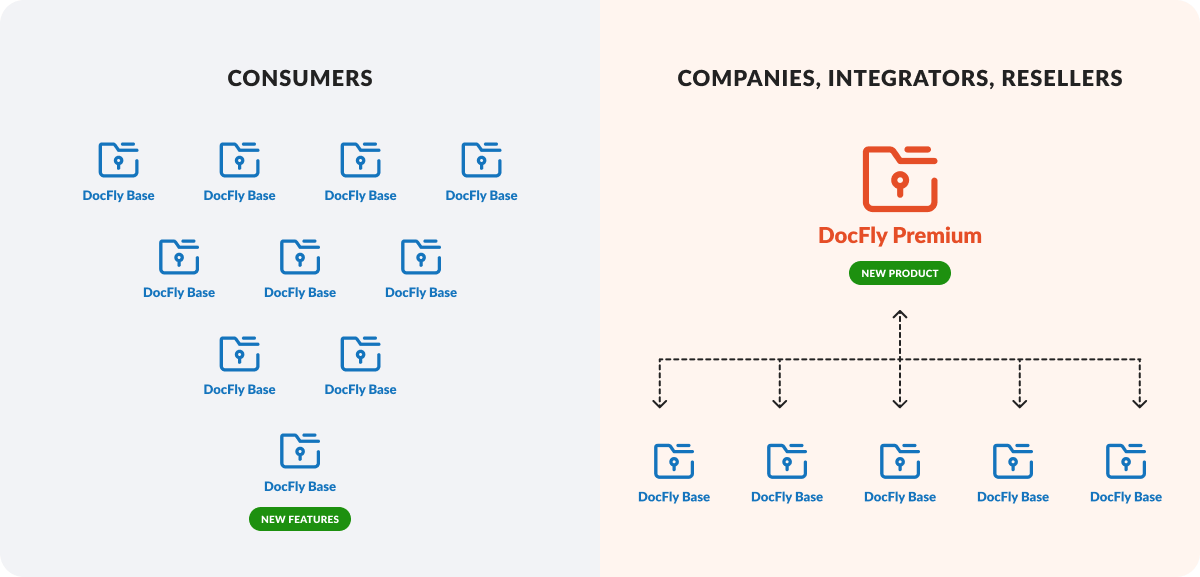
In parallel, the introduction of a new version — DocFly Premium — was planned to address the needs of large enterprises, system integrators, and resellers. The objective was to offer a high-level product that would allow them to manage their clients independently through a centralized, efficient platform.
Challenge
Designing a seamless and scalable ecosystem for both DocFly Base and Premium meant working within a highly regulated environment, where legal constraints and technical limitations shaped every decision.
The real challenge wasn’t just about improving usability — it was about simplifying complex workflows without compromising compliance, and at the same time introducing a user-centered design culture in a company traditionally driven by development.
I needed to create a fluid experience across both products, make interactions more intuitive, and build a foundation that could support long-term growth.
Impact
➡️ Accelerated operations through seamless integration
The integration between DocFly Base and Premium empowers clients to work more efficiently across platforms and executing complex operations without friction or delays.
➡️ Strategic design that reduces operational costs
A user-centered, iterative design approach transformed the platform into a streamlined tool that minimizes complexity and reduces the volume of support tickets by 35% — cutting overhead and improving service quality.
➡️ Productivity up, time waste down
By redesigning the information architecture and optimizing key workflows, task completion times were reduced by 30% — freeing up time and resources, and enabling teams to focus on higher-value activities.
Problem
⛔️ Misalignment with user needs
The Base version lacked several essential features that users considered fundamental for efficient document management—such as more autonomy in configuring document classes, the ability to schedule recurring reports, and options for bulk downloading files via web services or FTP. As a result, the platform did not fully meet user expectations compared to more comprehensive competitor solutions.
⛔️ Lack of enterprise-oriented solution
There was no dedicated solution for enterprise clients, system integrators, or resellers. This gap made it difficult to address the needs of more complex organizations that required greater autonomy and control.
⛔️ Designed for experts, not everyday users
Users perceived the platform as a tool designed for highly technical or expert profiles, where even the simplest features were difficult to access or understand. This lack of usability negatively impacted productivity, increasing the time and effort required for effective document management.
⛔️ Information architecture misaligned with user expectations
The platform’s structure didn’t reflect how users naturally organize and search for content. Key actions were hidden or difficult to find, making navigation inefficient and increasing time spent on routine tasks—especially for less technical users.
⛔️ Accessibility and visual identity gaps
The interface did not meet accessibility standards and lacked a clear, coherent visual and communication identity—two critical aspects for long-term scalability and product consistency.
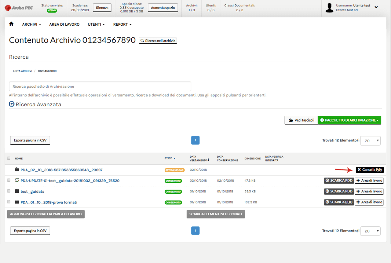
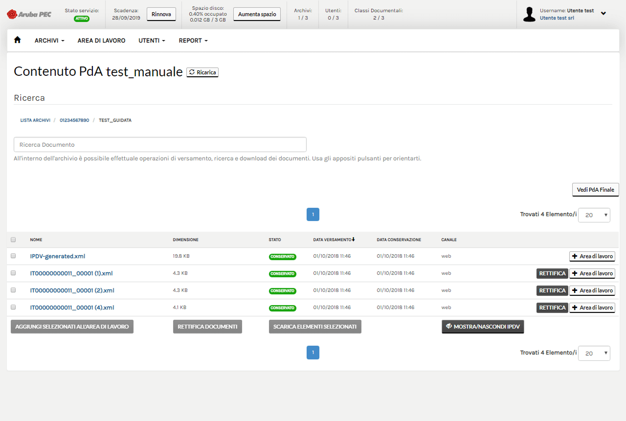
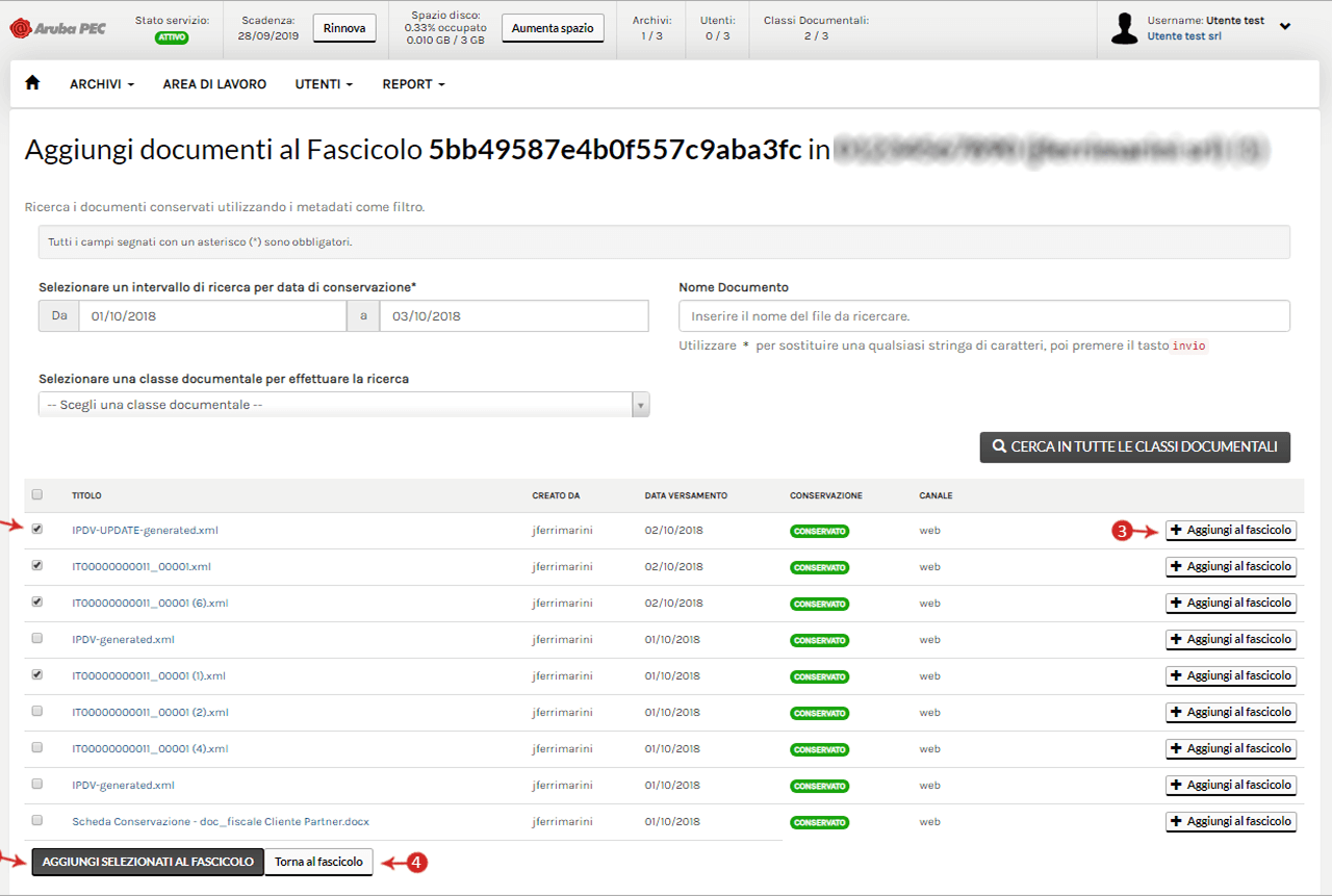
Before
Solution
✅ UX Research that drives decisions
Through targeted surveys, interviews, and usability tests, I gathered actionable insights that shaped the design strategy from the ground up. This research enabled a deep understanding of user behaviors and expectations, leading to clearer prioritization of features and more informed product decisions.
→ Result: The design process was fully aligned with real user needs, reducing guesswork and increasing stakeholder confidence
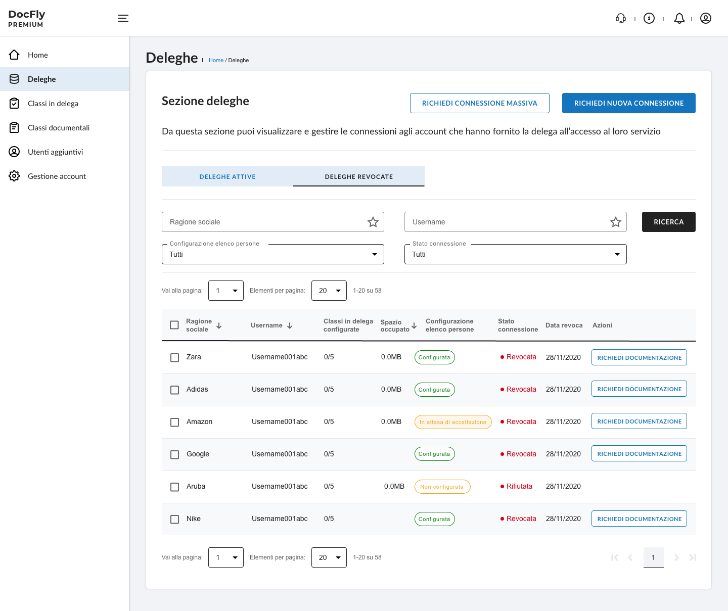
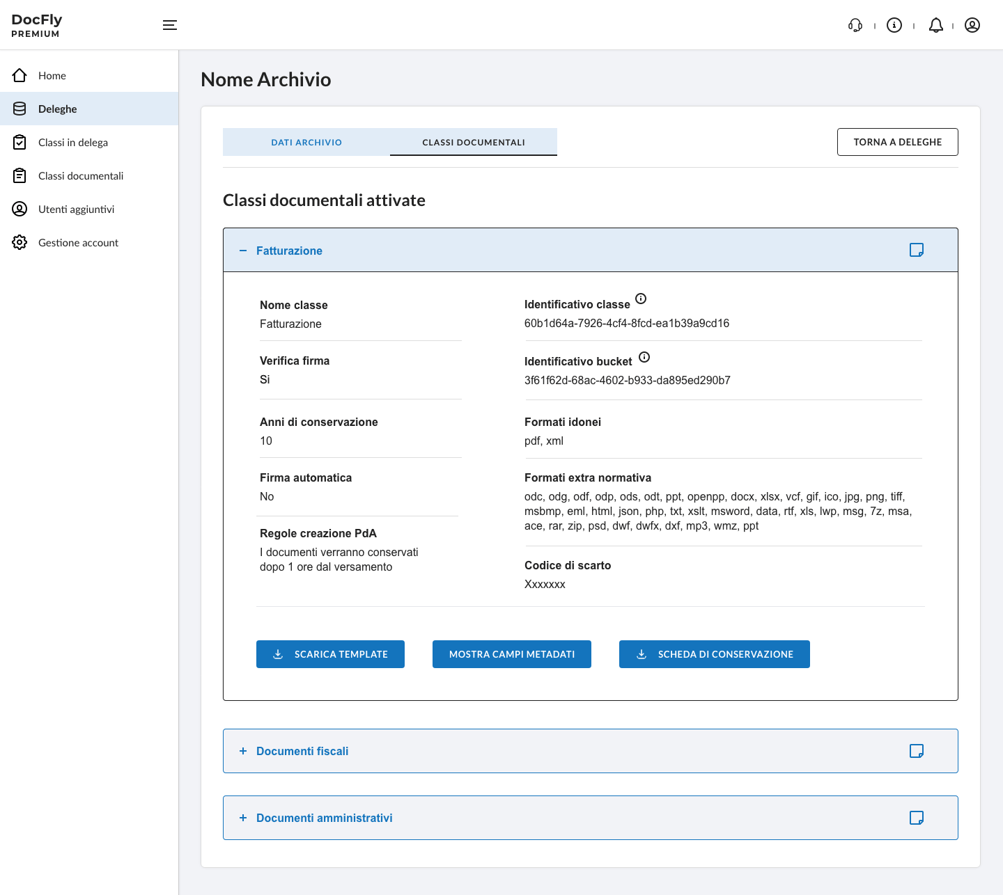
✅ Improving information architecture and simplifying workflows
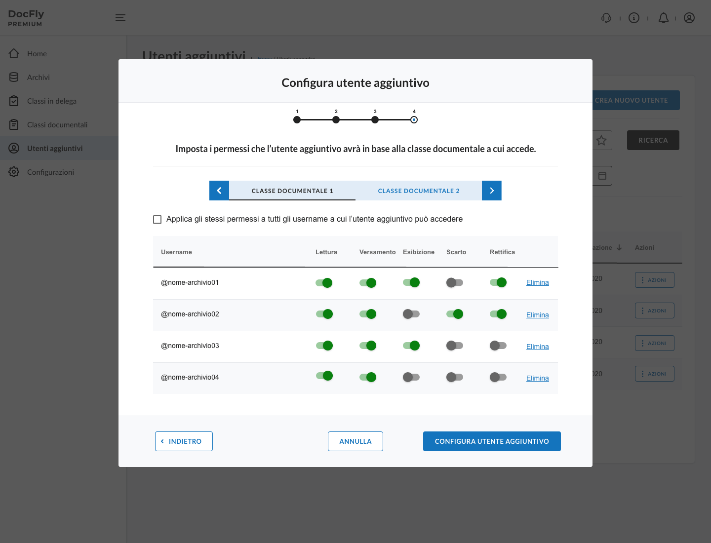
I redesigned the information architecture and user flows to reflect how users think and work, making navigation more intuitive and key processes—like uploading and archiving—more efficient. Complex tasks were simplified through a step-by-step approach that guides users through each action, reducing cognitive load and making it easier to complete even the most advanced operations with confidence.
→ Result: Users complete tasks more efficiently, with reduced errors and a lower learning curve
✅ Iterative testing and continuous validation
Multiple rounds of usability testing were integrated throughout the design process, allowing early assumptions to be validated, usability issues to be identified, and improvements to be made quickly. Close collaboration with the development team during sprints ensured continuous alignment between design and implementation.
→ Result: More focused and effective design iterations, significantly reducing rework and accelerating development
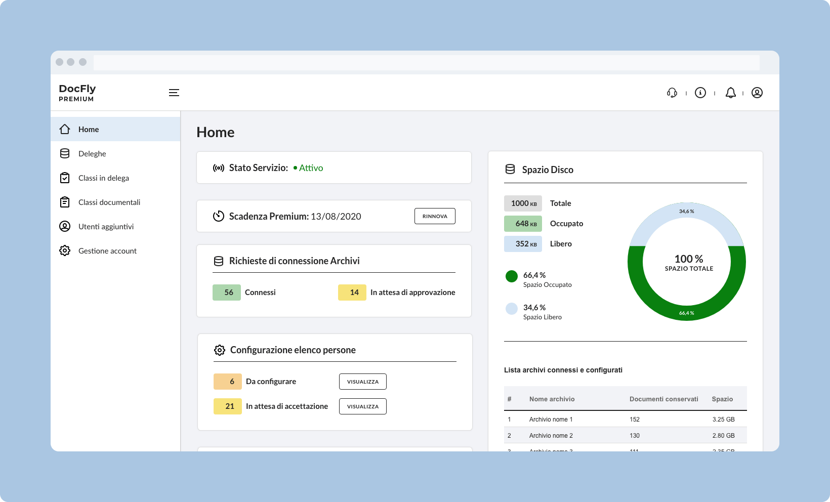
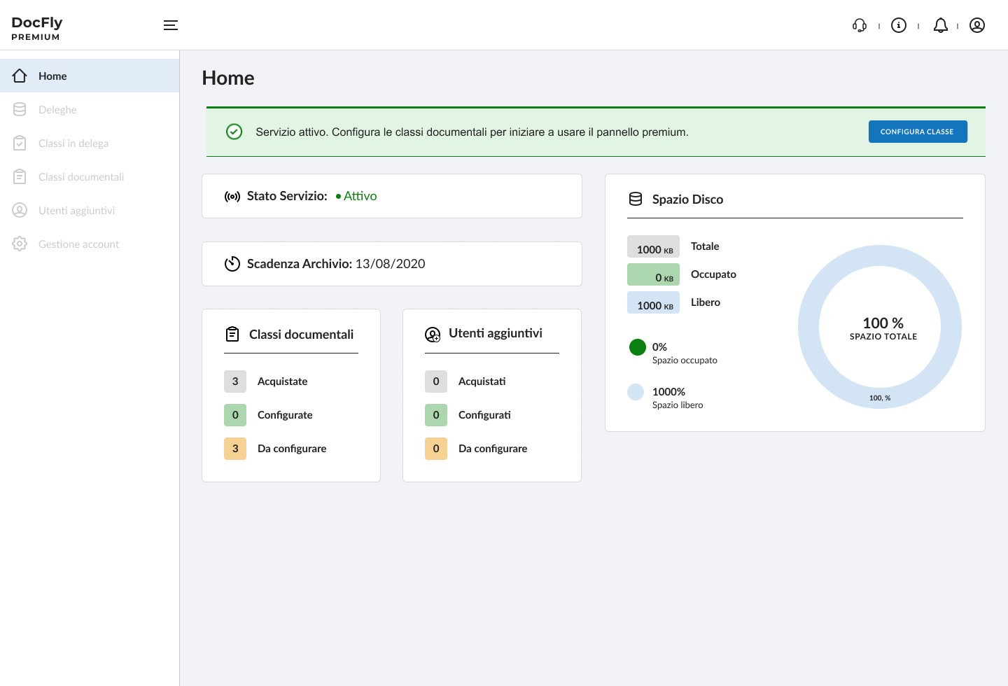
✅ A dashboard that empowers users
I introduced a fully modular dashboard designed to offer real-time visibility into all key aspects of the system — including archiving progress, upload errors, storage capacity and more. The interface was structured to provide clarity at a glance and support both operational monitoring and decision-making.
→ Result: Improved operational efficiency and faster decision-making, leading to reduced downtime and more proactive document management
✅ Building for scale with a UI KIT
I built a new UI KIT using Material UI, aligned with Angular development requirements. It ensures consistency across the interface and accelerates collaboration with developers, supporting future product expansion.
→ Result: Faster implementation, easier maintenance, and a scalable visual language ready for growth.
DocFly 3 highlights
Key improvements that enhanced usability, productivity, and scalability across the platform.
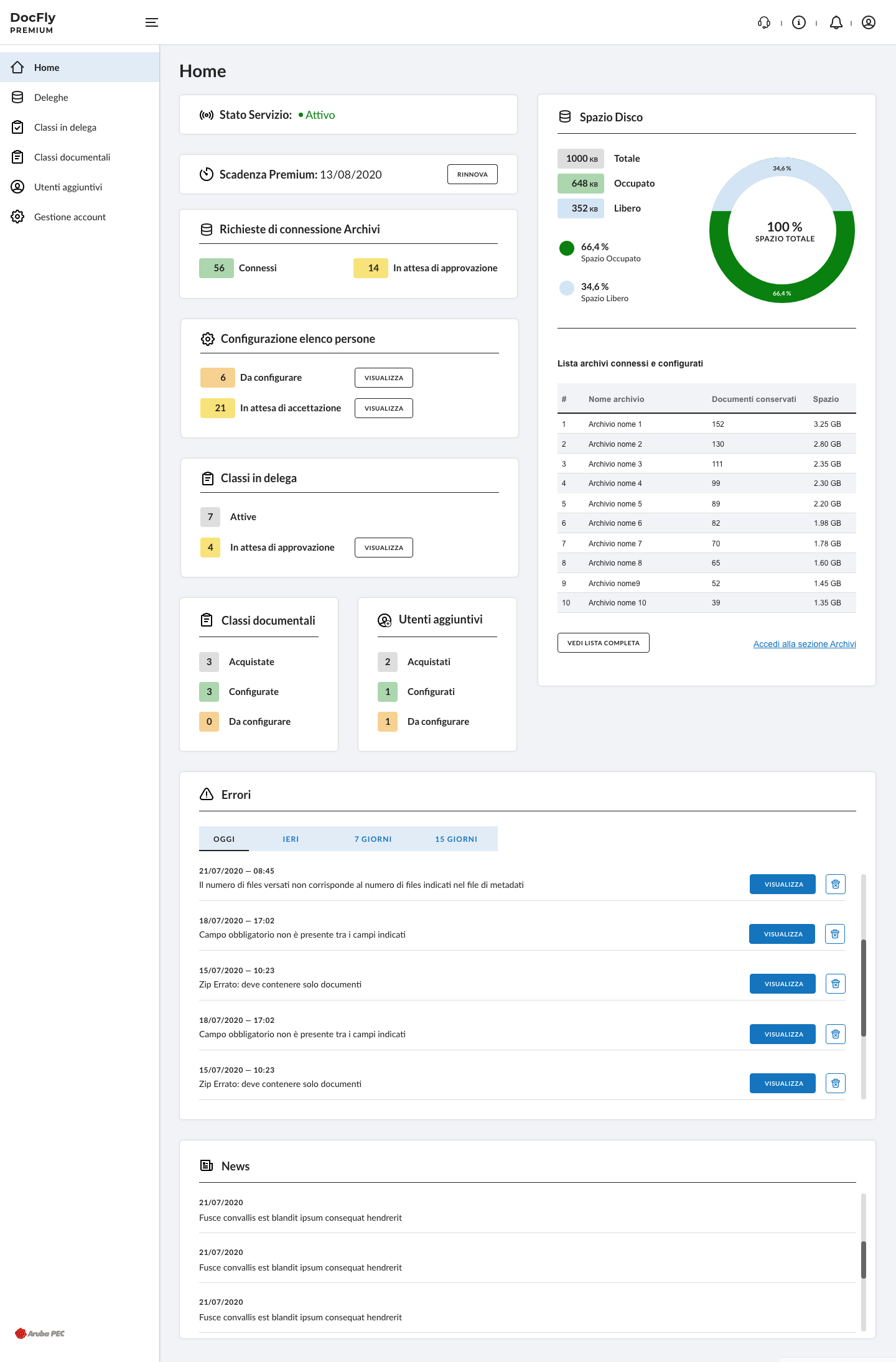
Modular Dashboard
Customizable and scalable across both Base and Premium
New UI for consistency and scalability
Built on a shared UI Kit to ensure visual coherence and support future growth.
Streamlining navigation improving IA
Redesigned for more intuitive navigation and quicker access to key features.
Step-by-step Flows
Reduced complexity and improved task focus
Responsive Feedback
Timely, reassuring messages for every user action
Achievements
I proactively introduced and championed UX Research in a company still heavily rooted in a development-driven approach.
UX Research activities were positioned as a strategic foundation for the design process, driving key decisions and aligning the UX strategy with both user needs and business goals.
This shift enabled more informed product choices, reduced task completion times, and significantly improved user satisfaction.
Let's design together ✨
Feel free to reach out to talk about a project.
Hey there, this i